Making Rammas feel human, redesigning DEWA's AI customer service robot
Transforming Rammas from a novelty into a trusted, task-driven customer service assistant through conversation design, UX research, and a complete redesign.
Rammas is DEWA's humanoid robot, originally developed by SoftBank Robotics and deployed across customer service centres in Dubai. Designed to assist visitors with queries using conversational AI, the hardware was capable, but the experience didn't live up to that potential.
I led the end-to-end redesign of Rammas, covering UX research, conversation design, interaction flows, and visual language, working closely with developers and stakeholders throughout. The goal was to shift Rammas from something users ignored to a service they actively chose to use.
The redesign led to a 40% increase in customer satisfaction, a 20% decrease in bounce rate, and an average of 150+ customer interactions per week within the first three months of launch.
Full potential, barely used
01When Rammas was first deployed, it was mostly used for basic greetings and simple queries, far below its potential. Limited functionality and poor execution led to incomplete, frustrating interactions, causing users to overlook it or disengage quickly.
Initial feedback revealed a gap between perception and potential. While users were curious and appreciated Arabic language support, the main challenge was not the hardware, but the experience.
Not a hardware problem. An experience problem.
Rammas was powered by SoftBank Pepper, equipped with cameras, microphones, depth sensors, and a tablet interface for voice, gesture, and multimodal interaction.
However, the experience failed to utilize these capabilities. Dense text and hidden options made interactions unclear, reducing an advanced interactive robot into what felt like a static screen.
Shifting the interaction model
02The core issue wasn't just usability, but how the interaction was structured. Rammas relied on users to lead the conversation, with little guidance or clarity on what was possible. The redesign shifted this from a passive interface to a guided experience, where users were led through clear paths based on intent, reducing uncertainty and improving completion rates.
What began as a usability fix evolved into a full rethink of the interaction model. The case study below breaks down the decisions and process. Here's a snapshot of what we achieved at the end of this project.
Key achievements
- Clear, guided interactions that reduce uncertainty and drop-off
- Faster access to key services through structured conversation paths
- More intuitive interactions aligned with real user behaviour
- Seamless recovery and escalation without dead ends
- A more approachable experience that encourages continued engagement
Research first, design second
03Before design began, the priority was to fully understand the experience and its context. This included user feedback from service centres, an assessment of the robot's capabilities, and benchmarking against similar systems. Only then did design begin.
I began with a UX audit combining user feedback from surveys, focus groups, and usage data. A heuristic evaluation of the interface uncovered additional issues, including accessibility gaps, poor information architecture, and interactions that failed to consider the unique context of a robot-mounted screen.
Assessing capabilities and benchmarking
With the core issues mapped, I researched the robot's capabilities and analyzed similar implementations to identify opportunities. Using an impact-effort matrix, I prioritized improvements that would deliver the most value within the project timeline while addressing the highest-friction user issues.
Ideation & information architecture
With research complete, I restructured the information architecture, defining navigation, conversation paths, and user flows from greeting to task completion. Speech patterns and response logic were designed alongside visual flows to create a cohesive experience across both voice and screen interactions.
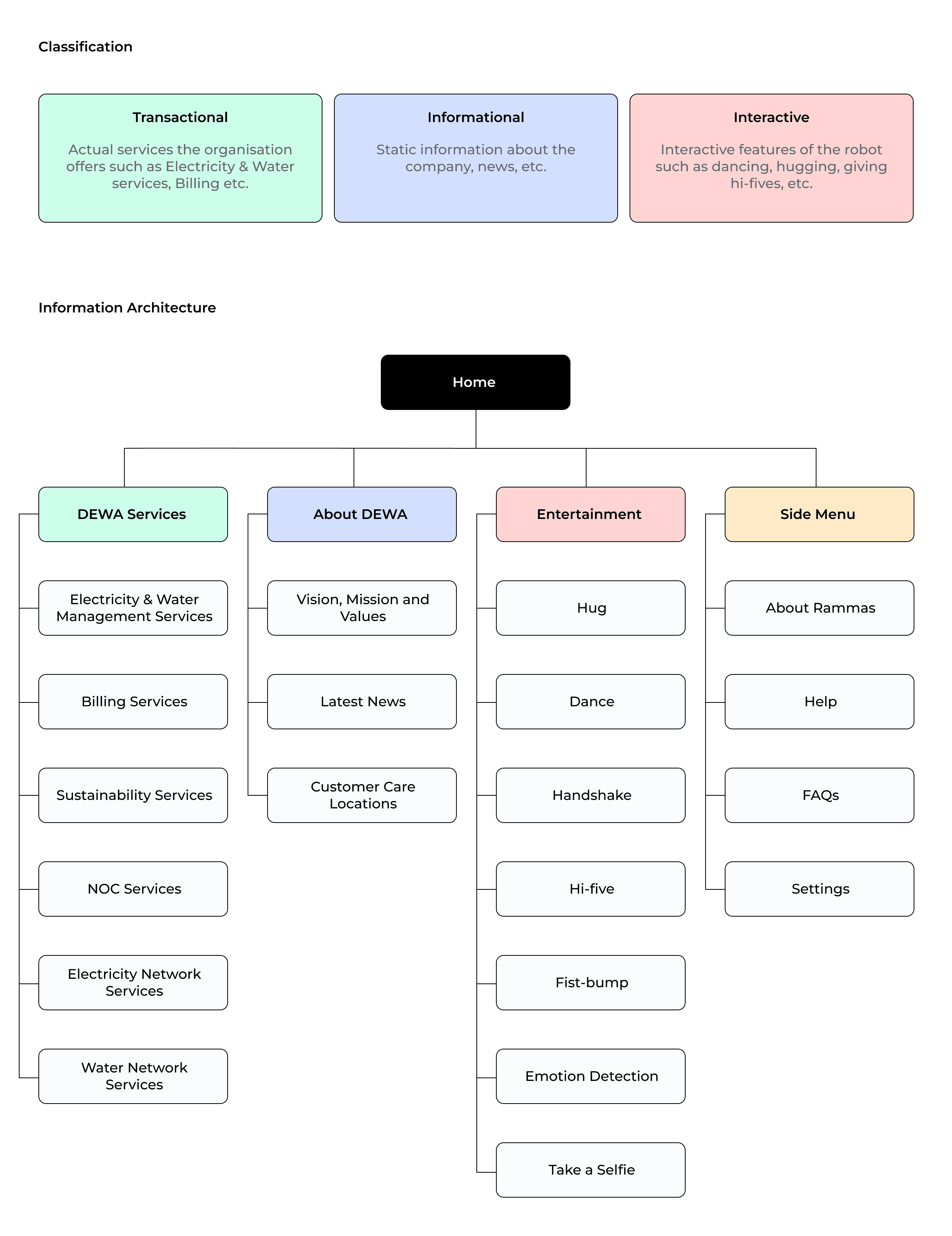
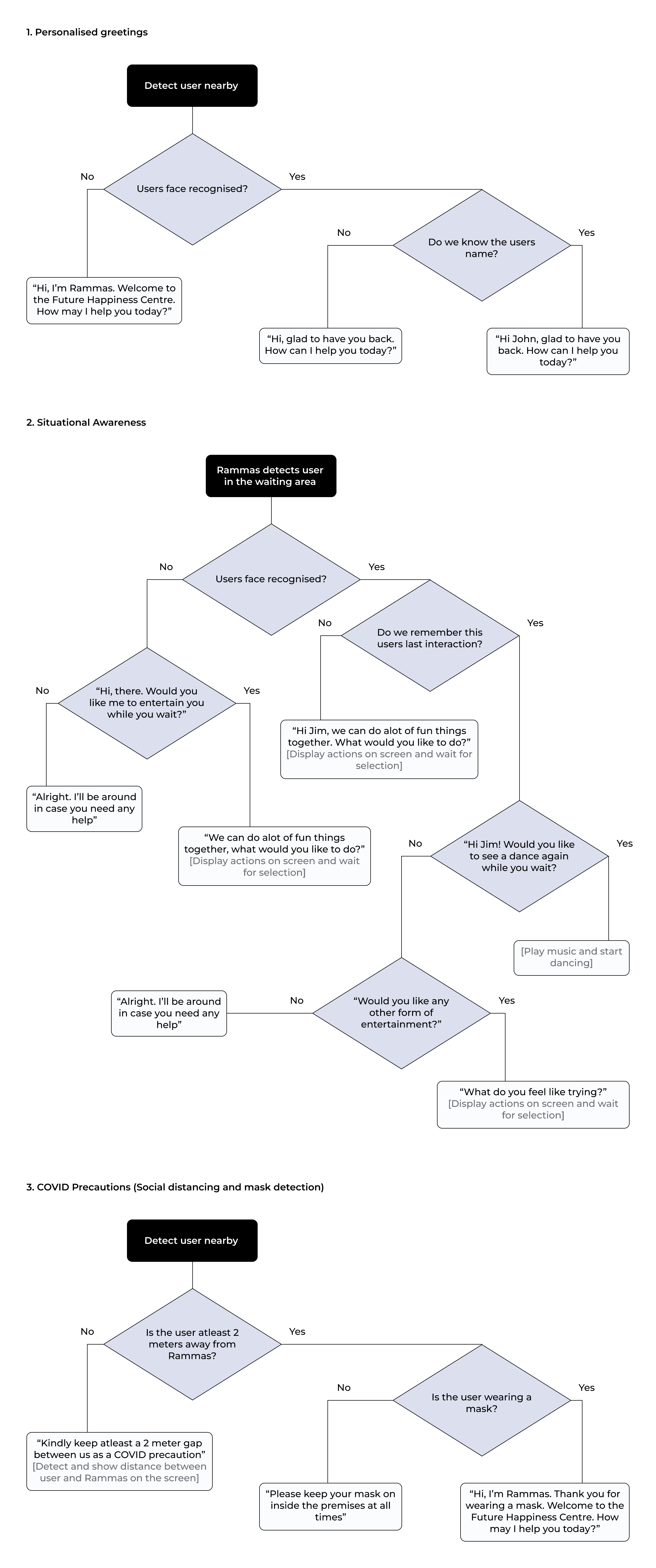
Building the conversation in Dialogflow
With the conversation flows defined, we built them in Google Dialogflow, defining intents, training phrases, and responses for both English and Arabic interactions. Fulfillment webhooks connected complex requests to DEWA's backend systems, while fallback flows helped users recover from unclear inputs or transition to human support when needed. Since this was before widespread LLM adoption, every interaction had to be intentionally designed and accounted for.
Sketching & wireframes
Early ideation focused on exploring a wide range of directions before committing to a structure. Given the timeline, I moved directly from sketches to high-fidelity designs, using sketches as the primary validation step.
The finished product
04The redesign shifted Rammas from a static, formal interface to a more approachable and responsive experience. A softer visual language and clearer layouts improved readability and reduced friction.
Conversation flows and microcopy were refined to guide users through each step, with built-in recovery paths and escalation options. This made interactions more predictable, reduced drop-off, and increased overall engagement.
Rolled out and recognised
05Rammas was initially launched in the DEWA Head Office as a test case before rolling out to all other offices. Usability testing sessions were arranged for one month post launch to gather feedback from real users on the new designs and validate the changes and/or make any iterations based on the feedback.
The results were overwhelmingly positive with a few suggestions on further improvements that we included in our enhancement plan.
40% Increase in Customer Satisfaction Rate
Measured via post-interaction surveys
20% Decrease in Customer Bounce Rate
Measured via analytics for the first three months post launch
+150 Customer Interactions Per Week
Average for the first three months measured via analytics
Post launch
Following a successful launch at the head office, Rammas was rolled out across all DEWA locations, including the Digital DEWA office at Emirates Towers. It was also featured at the DEWA Pavilion at Expo 2020, where it interacted with over 500,000 visitors during the event.
Reflections & takeaways
06This was my first time designing for a physical robot, and it introduced challenges you don't face in purely digital products. The user's position, the surrounding environment, the robot's movement, and the relationship between voice and screen all had to be considered. Every decision needed to account for this physical context, not just what appeared on the interface.
The biggest shift was moving from a screen-first mindset to an experience-first one. The screen was only one part of the interaction. What mattered just as much was how the conversation flowed, how the system responded, and how natural the overall experience felt.
